
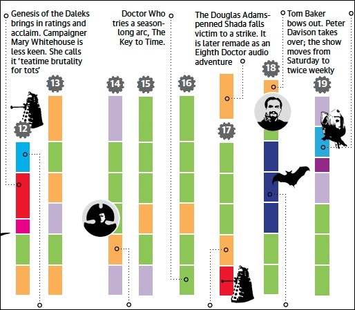
Well, 50 years up to the most recent Christmas episode, “The Snowmen,” because this graphic was created before the latest series. But it’s still cool. Here’s a couple of little tastes:
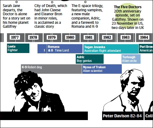
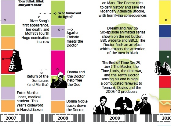
Created by Kari Pedersen of the Guardian’s Data Blog. Download the whole thing as a PDF here.
(If you stumble across a cool Doctor Who thing, feel free to email me with a link.)


It’s interesting; as I’ve been re-watching the early stories, though, I’ve been struck by how huge the mood swings are when the producer changes, and I’d be inclined to put the holder of that role onto any such chart. (Particularly noticeable with Tom Baker’s last season, in which much of the previous setup was being deliberately dismantled.)