
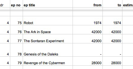
David McCandless of Information is Beautiful thought it might be beautiful to catalogue “every single journey through time made by the Doctor, featuring start year, end year, and location.” So he did it. Not on his own — he had geek crowdsource assistance — but though it continues to be a work in progress (you are invited to submit corrections or additions), the results are now available at the Guardian’s DataBlog.
McCandless has not yet visualized the information — which is what makes it beautiful, like his gorgeous graph of every Doctor Who villain, which I featured recently. But presumably that is coming soon:
Last year, I created a visualisation of Time travel in TV & Films. You know. Star Trek, Back To The Future, Planet Of The Apes etc.
I deliberately left out Doctor Who. It would’ve spaghetti-fied an already pretty hectic image.
All the time, though, I really wanted to do a mega-visualisation of all of the Time Lord’s journeys.
And now he has the foundation of info he needs. You can download the spreadsheet for yourself and revel in the geeky glory of it.
(Thanks to readers Keith and Brian for independently sending the link. If you stumble across a cool Doctor Who thing, feel free to email me with a link.)


The chart that Mr. McCandless mentions for all the other cinematic and TV time travel is pretty cool, especially when he notes different characters’ overlapping travel to the same time, producing “paradoxes.” I love Information is Beautiful.
Oh, and you’re welcome. :-)
Can this be the Doctor Who thing of the day? http://ericschmiedl.photoshelter.com/gallery-image/Hack-Tardis/G0000HWD58nhSVYU/I0000hEJk3JVS4AU
MIT Hackers are brilliant.